
Technique
Five things you can do with simple tools that look far more complicated
Combining basic operations in the right order produces results people assume require a design suite: a reflection from a flip and a fade, a backdrop from a heavy blur, a documentary look from luminance greyscale plus contrast.
Published Updated 6 min readEditorial policy
1. A reflection under a product shot
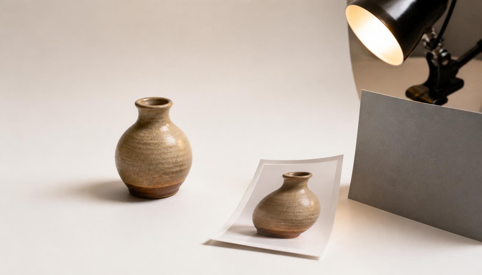
Duplicate the image, flip the copy vertically, and place it directly beneath the original with reduced opacity in whatever layout you are building. Because the flip is geometrically exact, the two halves line up perfectly — the effect that used to be a design-tutorial staple is two operations.
2. A blurred backdrop from the photo itself
Take the same image, blur it at a radius above 30 px, and use it as the background behind the sharp version. This is how streaming apps fill the space around a portrait-orientation thumbnail. The colours match automatically because they came from the same picture.
3. A documentary black and white
Convert to greyscale with luminance weighting, then raise contrast slightly. The luminance step is what separates a convincing monochrome from a grey mush — averaging the channels flattens skies and skin into the same tone.
4. A watermark that is actually hard to remove
Corner watermarks get cropped off in seconds. Placing the text diagonally across the centre at 25–30% opacity keeps the image readable while making removal a real editing job rather than a crop.
5. A consistent set from inconsistent sources
Photos gathered from different cameras and phones rarely match. Crop each to the same ratio, resize each to identical dimensions, then apply the same small contrast and saturation adjustment. Consistency reads as professional far more than any individual effect does.
Spotted something inaccurate? Send a correction — technical corrections are applied and the updated date changed.